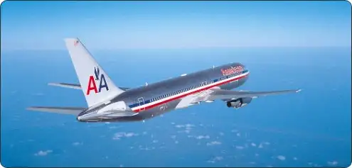
American’s new logo and livery are getting plenty of attention and commentary, much of it negative.
Here are some recent comments from the initial coverage:
- They should spend the money on customer experience rather than on rebranding. Plus, it is really ugly. (Corey)
- The real tragedy of this makeover is loss of the classic “AA” symbol. This was one of last true iconic airline logos left in the world — a timeless and elegant trademark. It has been replaced by a hideous, meaningless abstraction. The rest of the design can be forgiven (almost). Throwing away the AA emblem is another story. What a terrible new identity. (Patrick Smith)
- I didn’t know that American merged with Cubana. (cynicalJew)
- The logo on the fuselage is ok but the tail looks too “busy.” (Rich787)
- The old livery and logo was better. (Ondrej Bocek)
- Hideous. (Matt)
There was not a single positive review in the lot.
In a Flyertalk thread on the new visual branding, the responses were more mixed. A poll showed 49.3 percent with generally positive views of the change, 41.3 percent with negative views, and 9.4 percent “not feeling much one way or the other.”
If American was hoping for an outpouring of support for the new identity, it clearly miscalculated. For now, the best that can be said is that the considerable resources so far expended on the redesign exercise have yielded a “controversial” result.
Tastes do change, however, and more often than not the shift is from the negative to the positive. I’m reminded of the first-generation Ford Taurus, with its relentlessly oval-themed body panels and interior fittings. Through the years, public opinion evolved from derisive to appreciative.
American’s only hope now is that we’ll see a similar gradual warming toward its new colors.
Reader Reality Check
What’s your take on American’s new logo and color scheme?
This article originally appeared on FrequentFlier.com.
We hand-pick everything we recommend and select items through testing and reviews. Some products are sent to us free of charge with no incentive to offer a favorable review. We offer our unbiased opinions and do not accept compensation to review products. All items are in stock and prices are accurate at the time of publication. If you buy something through our links, we may earn a commission.
Related
Top Fares From
Today's Top Travel Deals
Brought to you by ShermansTravel
Kenya: 14-Night Tour, Incl. Tanzania &...
smarTours
 vacation
$7125+
7-Night Caribbean Round-Trip Cruise From Orlando:...
Norwegian Cruise Line
 cruise
$739+
Ohio: Daily Car Rentals from Cincinnati
85OFF.com
 Car Rental
$19+


